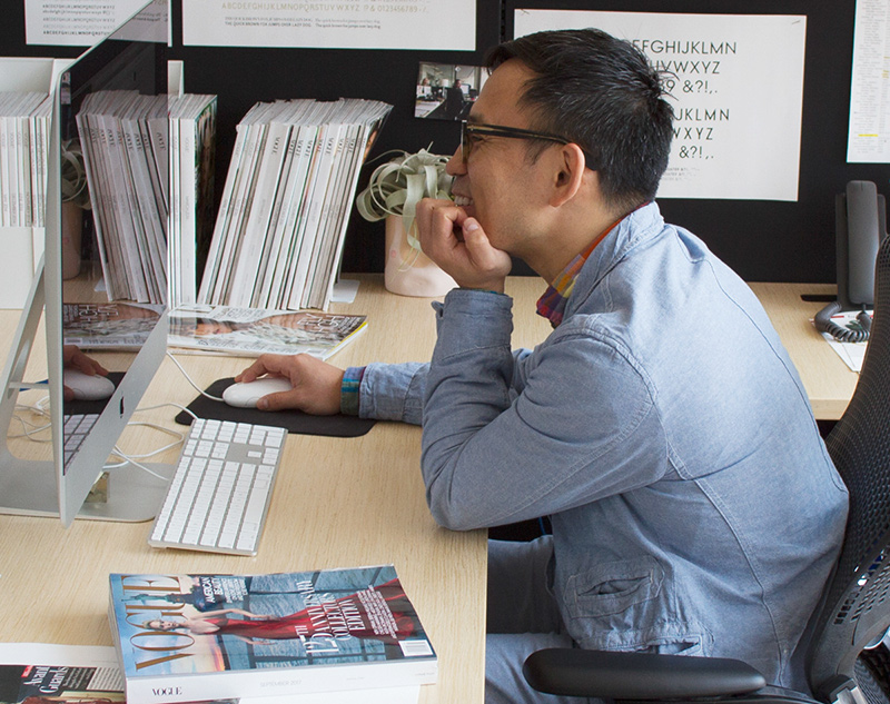
Fashion Photography and a Life in NYC
Born and raised in Shizuoka, Japan, NOBI developed his creative ability by LEGO bricks. After spending two years in Tokyo, he moved to NYC, the city made him struggle over his career direction - whether to study design or photography - and then brought an encounter with ENGINEERED GARMENTS.ー You are from Shizuoka, aren’t you?
I was born and raised in Shizuoka until high school. My parents’ house is located within walking distance of Shizuoka Station. Because they ran a factory and were always busy working, I used to play with LEGO bricks by myself when I was small. I had a bucketful of the bricks and used the edges of tatami mats to resemble roads for my LEGO cars. Looking back now, the bricks developed my creative mind, I think.
ー Do you have a particular thing or incident that triggered your desire to be a graphic designer?
It actually resulted from a chance because I originally came to NYC to study photography. After graduated from high school, I had studied at a technical college of design in Tokyo for two years. Though I seldom showed up for school (laughs), articles like “the latest fashion photography” on STUDIO VOICE magazine kind of caught my attention at that time. Then I made up my mind to study photography abroad. Though London was also a possible destination, I somehow chose NYC after attending to an orientation meeting at college. I could make it because my parents supported me. It definitely a wise decision. If I had stayed in Japan, I would have helped my parents’ business.
ー So, you studied design in Tokyo and then went to NYC to study photography, and came back to the world of design again.
That’s right. I came to NYC in 1995 and started to study photography at Parsons School of Design after studying English at a language school. The course I took at Parsons didn’t have basic art classes in the curriculum unlike any other courses, so we had studied only photography for all four years there. But in our junior year, we had a graphic design class that was required of everyone. In1999, Mac computers were not so universal and one of my classmates who hadn’t used it before asked me to assist him. While I was helping him with his work, he introduced me to an intern job as his friend was looking for a graphic designer. I then went to the design office for an interview without really thinking about it. I actually didn’t even know what kind of projects the company had participated in at that time. So, when people in the office asked me about it after employing me, I couldn’t answer it because of the lack of previous knowledge. When looking at the portfolio of the office later, I was amazed to learn that they had done many projects I had seen in the articles of Japanese design magazines I used to read.
ー The office was owned by AR New York, an established fashion ad-maker in NYC.
Yes, and I continued to work for them as a full-time designer after graduation. While working with them, I realized that it is an art director who generate new ideas for a project though I had thought photographers had more authority over it. Convinced that it was the job I wanted to do, I made a decision to be a designer.
ー How did you start working with ENGINEERED GARMENTS (EG) ?
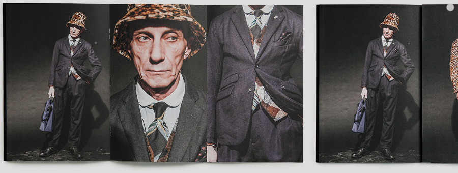
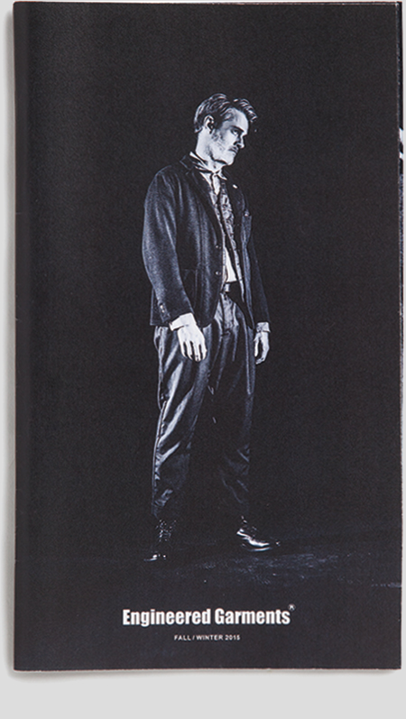
I had visited NEPENTHES store before we got to know each other for some reason as I had heard that the brand had a store in Soho. Later I met Tokuro (Aoyagi, the creative director of NEPENTHES) in connection with my ex-classmate of Parsons and we had an enthusiastic conversation on martial arts then. I began learning Jiu-jitsu right after that and gradually grew a great relationship also with Daiki (Suzuki, the designer of EG) and other staff at the company’s NY office. I think it was around 2001. As both of us got to know each other’s job, I naturally started to participate in projects of EG after a few years. When they asked me to make their image booklet, there wasn’t a fixed budget as it was the first time for them to do it. So, I tried to do my best with as small budget as possible. The photos were originally taken my compact digital camera with reading lamps in their office as lighting. Since the size of each digital camera image was only 1.4M or so at that time and I couldn’t use those so large on the booklet, I left a wide margin on each page. In the end, we decided to make the booklet accordion folded and printed in monochrome to reduce the manufacturing cost. But I think the limitation made the design more interesting. The first photo shooting for the brand’s booklet was held in 2004 and I just finished to design the one for Spring-Summer 2018. That means we’ve done it for fourteen years! (laughs)
ー Looking anew at those, you may realize that you’ve created tons of booklets for the brand because each year has Spring-Summer as well as Fall-Winter versions. What did you think when you first saw EG collection?
It actually didn’t make sense for me at first. I didn’t know much about clothing, so everything I could do at the time was to conclude the offered project as successfully as possible. But, as I began to wear the brand’s clothes, I gradually understood the point. While we have been working together on the project for a long time, Daiki has occasionally told me things like what he always cares when designing clothes, newly added details and the points he puts extra effort into. So that I started appreciating EG. As a fan of the brand, I think it’s really nice that we can mix and match clothes from the current collection with the ones from the older collections as the brand’s underlying philosophy remains unchange. As a person often wearing a jacket with matching pants for work, I prefer wearing the ones from NEPENTHES as those are not too formal, nor too casual. When I visit NEPENTHES office for a meeting, Daiki says to me “What you are wearing today is a classic piece of EG” “I like the faded color of your well-worn clothes” or something like that (laughs). People often ask me which brand’s clothes I’m wearing when walking along a street, taking a subway or working in office.
ー What do you care most when making an image booklet for EG? Is there anything that you keep in mind?
Although clothing design and graphic design are totally different, I’ve been influenced by what Daiki thinks “sophisticated” when making his brand’s booklet. It was totally new to me to know the way he accepts the out-of-sync appearance, the rough finish and the odd folds of vintage clothing. So, I keep it in mind when designing a booklet for his brand. And I try not to blur the clothing design because that is what people would look at. Until Spring-Summer 2012 collection, I looked after things like photo shooting, retouching, design and submission for the brand’s booklet making. Because the time between the arrival of sample clothes and the seasonal exhibition was quite short, I’d do it all by myself rather than asking other people the direction. It led to a time saving as I could conduct shooting while selecting photos and creating a rough layout at the same time. Now JIMA takes care of photos and it’s really exciting for me because he can take photos that I cannot take by myself. It also helps me to concentrate more on designing (laughs).
His Design Career and the Joy of Designing
NOBI currently belongs to Condé Nast Publications, one of the biggest magazine publishing houses in the world, designing pages mainly for Anna Wintour’s Vogue at the company’s office in the newly built World Trade Center located in the place formerly known as Ground Zero. He told me about the joy of designing in the city with world-leading talents, as well as his future plans.ー How did you start working for American Vogue?
After joining AR New York in my third year in college, I tried to cut back on classroom time in order to set aside as much time as possible to work. I could eventually get a full-time position for the first time in my life and had worked for them for thirteen years since then. After getting a green card, I became a freelance designer and had participated in some projects until my ex-boss at AR New York and then design director of American Vogue asked me to help him to fill a vacancy in his team for two weeks. As they kept extending my contract, before I knew I became a full-time designer of the company. I’m now in my third year in office.
ー What do you actually do for the publishing firm?
For American Vogue magazine, I mainly design a fashion news section titled Talking Fashion every month. Recently all the magazine design departments in Condé Nast share the same office space as one huge design team and work also on non-magazine projects. So, I do some designs for such projects, too.
ー What is the most memorable project throughout your career?
Designing Vogue Italia with creative director Raul at AR New York was so fun. When he and his team came back from shooting, they handed me a series of polaroid photos, saying “This one will be on the cover of next issue. Design the rest as you like and show me when finish.” As they never determined the volume and design of each issue in advance, I could always try new things. For the March issue in 2002, they sent me a series of VHS tapes capturing a model repeatedly lying on a bed in various different dresses. What they wanted me to do was capturing good frames from the movies and arrange those images. Though it required me a lot of effort and time, I enjoyed selecting which frame we would use all by myself. A 64-page fashion story on the June issue in 2000 was also a challenging project I’ve ever undertook.
ー You have designed books, too, such as photographer JIMA’s photo book.
JIMA’s first photo book is my favorite work. My idea of the book was to change the paper size from page to page. I could realize it because of the cooperation of a printing office. I also asked them to bind it in an irresponsible way as I wanted to make it rather random. Though there were some limitations like it was impossible to change the paper size from page to page and we had to fold the paper in half, the result of this project was quite satisfactory as my concept could take a concrete shape. But people in the printing office said they would never do it again (laughs). Other than the project above, I have designed EXPERIENCE NISEKO, a give-away magazine of Niseko of Hokkaido, VERSACE, a book featuring the brand’s creation after Donatella Versace, and an over 400-page art book that contains a collection of tattoo work created by Horizakura, a NY based tattoo artist.
ー What is the joy of designing?
When it comes to graphic design, you always have a client except when you design for your own use and the client always have a preset goal for which your design to be used regardless of the length of the term. I think, the joy of designing is to find a way to contribute to the client’s goal, taking cues to do so from the client. So, it’s like doing a quiz or puzzle though you have to make pieces of the puzzle by yourself to tune it to the brand or particular products of the client. My job is to put the pieces together into one beautiful picture while guessing how it could stir the client’s sensibility, subtly containing the thing to be featured and making it look sophisticated.
ー While working in NYC, have you ever thought people in the U.S. have a different way of working from Japanese people?
American clients are generally more open-minded to my creative solution and let me freely develop the process as long as I get results. It’s quite rational and easy to work with them. On the other hand, however, they ask me to offer a sufficiently compelling vision because people in the U.S. are familiar with making a presentation. Even though I’m not good at speaking general English, I’m often asked to give a sales pitch. I’ve tried it again and again, but it’s still difficult for me (laughs). When I was a fledgling designer, I just had to create a remarkable work. But currently I’m in a position to take the leadership of a project team and it’s a matter of course that I make quality design. So, I now feel that it’s more important to make my work look more convincing.
ー You need to learn assertiveness. It must be pretty exciting to work there.
There are world-leading figures of the design industry in this city and I’ve learned a lot from closely observing their ways of working. By doing so, I can also gauge my own ability in both good and bad ways. However, as you carefully watch the process of making a design work that looks outstandingly impressive, you may realize that it is made up of simple tasks. Just like knowing the secret to a trick, you may then think that you can make the same thing. It was a great relief for me that all the people seemed to create their work just as they like.
ー Are there anything you want to do in the future?
Since I will start to take a course in typography and font making, I would like to design a magazine with my own fonts. If there are any Japanese companies or hotels trying to recreate their brand for overseas clients, I want to create all the brand images including logos, packages and advertisement. I also want to compile 28 image booklets of EG into a book and design it.
ー As a person who has known NEPENTHES for a long time, what kind of company do you think it is?
I’ve read that someone wrote in a book that if you could find a right job, you would look as if you are exerting considerable effort even though it’s not hard at all for you to do it as you just do what you love. I guess NEPENTHES is a company full of such people.
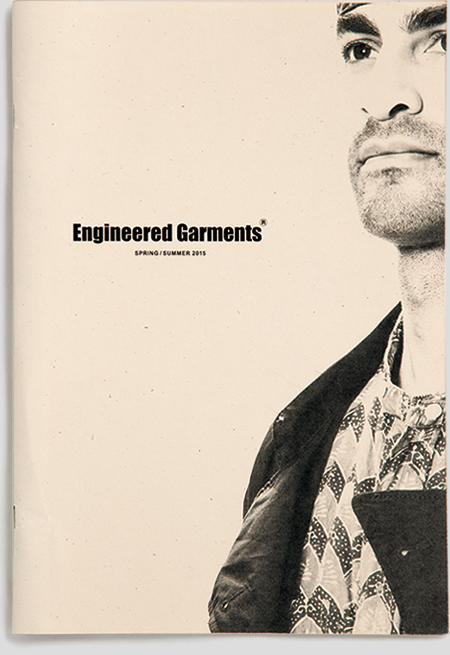
SELECTION OF IMAGE BOOKLETS
Image booklets selection with explanation of NOBI.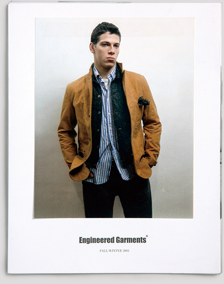
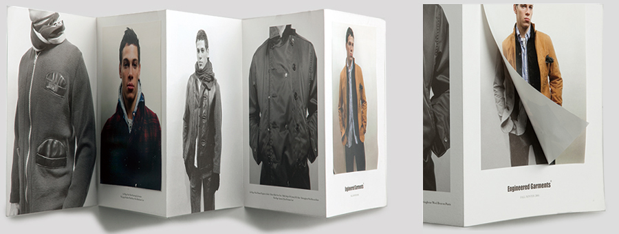
FALL / WINTER 2004 : The first booklet features an accordion fold design with two hand-glued colored photos. It looks like Gentry magazine and I love it. I shot the photos in Tribeca, where NEPENTHES office used to be located.
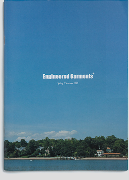
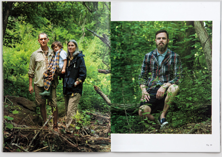
SPRING / SUMMER 2012 : We did our first location shooting. I was so impressed by seeing living helmet crabs for the first time. I was under terrible conditions on the way back and laid up after getting home. So, this season is really unforgettable for me (laughs).
FALL / WINTER 2013 : As EG wanted to do something odd around that time, I designed a booklet by folding and binding a poster to make it without beginning, end and correct orientation.
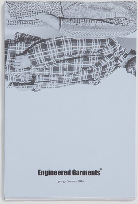
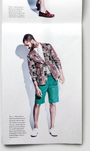
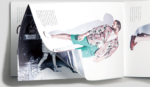
SPRING / SUMMER 2014 : It looks very simple on first glance, but you can find folded images in some pages. It’s a design with a surprise. I think some readers haven’t even realized it.
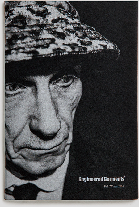
FALL / WINTER 2014 : I used a black paper and silver ink for the cover. The booklet contains some pullout pages for alternative photos for some looks and has the largest total number of pages so far. I did everything I could do for this.
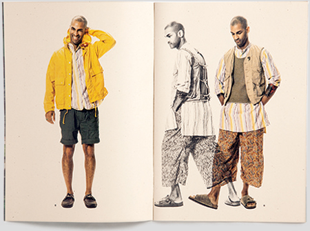
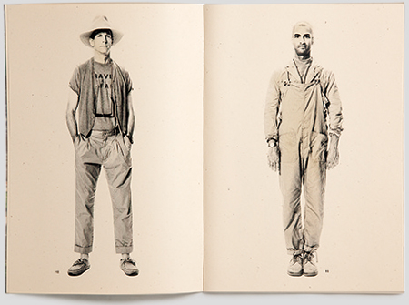
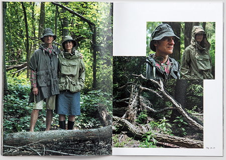
SPRING / SUMMER 2015 : Because Safari is the theme of the season, I printed it on kraft paper. I think it could highlight the collection which is full of beige color. The monochrome part also accentuates the whole design.
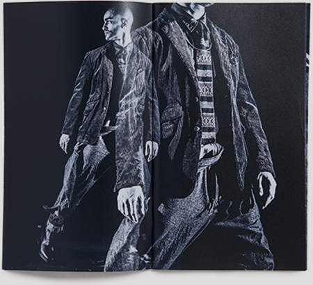
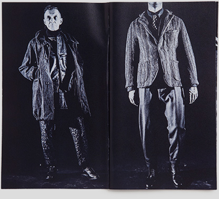
FALL / WINTER 2015 : In tune with the seasonal color, I used navy color throughout the book. I love the staunch, monochrome design. I made the colored version, but the monochrome one looked way cooler.
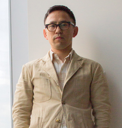
NOBI KASHIWAGI / Art director. Born in1975 in Shizuoka, Japan, he moved to the U.S. in 1995 and graduated the photography department of Parsons School of Design in 2001. Prior to graduation, he began to work at fashion ad maker AR New York in 2000, having participated in various fashion advertisement projects including ones for Versace, Dolce & Gabbana and Valentino as well as some branding projects for hotels as a member of a team. He also did some editorial designs for Another magazine, Harper’s Bazaar and Vogue Italia. His design for The Influence magazine won ADC Typographic Excellence Award. He established his own company Endash Space after becoming freelance in 2011 and participated mainly in branding projects along with designing books and working as an art director for fashion brands and IT companies. In 2014, he started to design for American Vogue magazine. Lives in Brooklyn. In Japan, he belongs to ATC.
http://a-t-c.jp/
